Analysis of a Typographic Composition by Adrian Frutiger
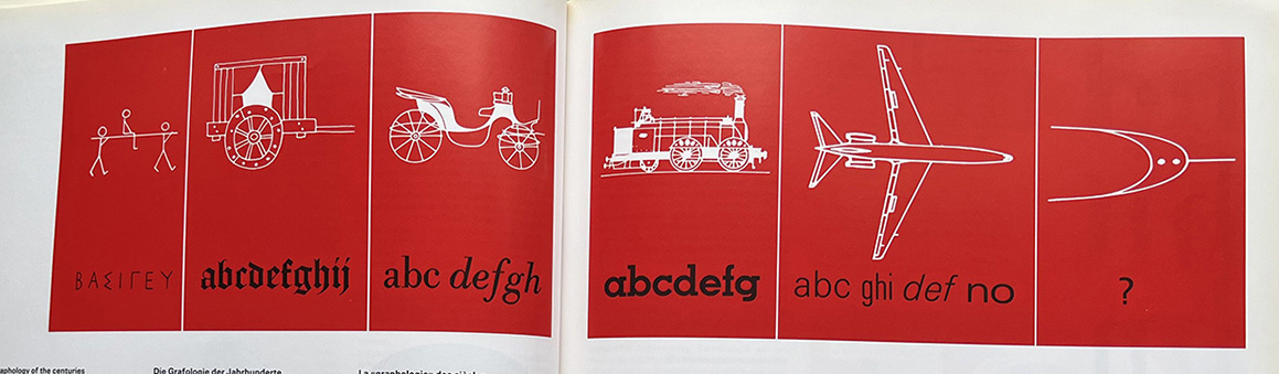
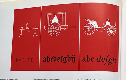
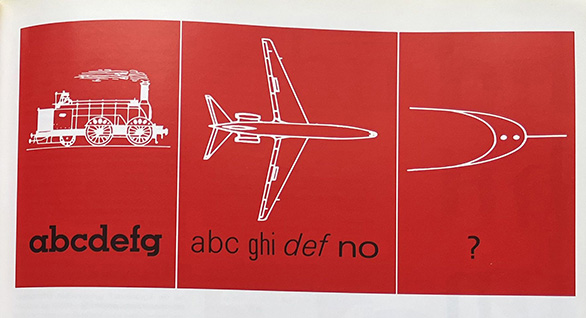
A typographic composition that includes graphics by Adrian Frutiger. From left to right: Roman monumental lettering, medieval black-letter, typefaces of the post-Renaissance, expression of the “New Realism”, typical sans-serif of the present day, representation of future typefaces. From Type, Sign, Symbol by Adrian Frutiger et al. 3 p. 42-43.
Adrian Frutiger showcases a visual narrative by comparing fonts against graphics of technical evolution. Each panel progresses from primitive to modern forms of transportation: a litter, carriage, early automobile, steam locomotive, airplane, and finally a futuristic imagining of transit. Beneath each graphic, Frutiger pairs a corresponding typographic style, moving from early letterforms to black letter, then to serif, and finally to modern sans-serif forms.
The composition is unified through the bold red background and the white graphics which contrast against the black text. The bright colours draw attention away from the details, making the focus more on the bigger picture. The layout is consistent from panel to panel, giving you the impression of a timeline.
It is clear that Frutiger is pointing out the parallels between what the graphic symbolizes and the type, equating typographic development with technological progress. This implies that they are correlated with one another, and that typefaces are a result of their historical and cultural contexts.
As transportation has become more efficient and advanced, typography has mirrored this shift by becoming the same. Typography is no longer just a way to communicate, just as transportation is no longer just a means of movement. Both have evolved past the understanding of the average person and have become something transformative. It is clear what Frutiger was trying to say with this typographic composition; typography is a system shaped by human needs akin to transportation.
Ultimately, the piece is not just about type; it is about human progress and our evolution past understanding. Just as the average person is unaware of the intricacies behind how a plane engine runs, they are equally unaware of how typography shapes their comprehension. That is why it is the responsibility of specialists to interpret the past to make way for the future.