The Influence of Univers on the Field of Typography
The release of Univers in 1957 marked a major turning point in the development of modern typography, fundamentally changing how designers understand type systems, legibility, and visual communication. Univers was conceived as a cohesive whole, a unified family that could be applied in a variety of uses. Not only was it influential in the fact it was a systematic typeface family, but it also helped to legitimize sans-serif fonts in the eyes of typographers. 6, 7
Univers introduced an unprecedented level of structure and consistency to typographers that had never been seen before through its unique approach to type. Typographers no longer needed to combine multiple unrelated fonts to create variation; they could rely on a single typeface family to create the contrast and hierarchy they needed in their designs. Univers is representative of the shift in ideals at the time of its conception to prioritize clarity and order. It marks the movement in typography where the functionality and versatility of typefaces were valued over decorative expression, aligning with the principles of modernist design. 6, 7
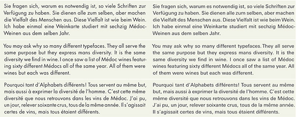
Univers (left) and Futura (right). An example of the versatility of Univers, in different languages it appears consistent, unlike Futura. From Adrian Frutiger – Typefaces : The Complete Works by Osterer and Stamm. 6 p. 100
Univers also expanded the creative possibilities of typography while demanding greater skill from designers. The variety within Univers enabled a “a play of contrasts never before achieved” (“Deberny Et Peignot’s ‘Univers’, 1957”) encouraging typographers to explore hierarchy, scale, and weight more deliberately. However, this assortment of typefaces demanded a higher level of skill and knowledge to use them, making it clear that typography was not a purely mechanical field. 7
Sans-serifs like Univers were previously regarded with negative views, thought of to be lacking the necessary style—hence the coining of the classification “Grotesque”. Typefaces like Futura sought to free themselves of these biases of the past, doing away with what others thought a font should be. With Univers there was no overt rebellion, it quietly redefined expectations by demonstrating that a sans-serif font could achieve both clarity and refinement without relying on rigid geometry. Univers was designed with careful optical adjustments, prioritizing readability and balance over purely mathematical forms. This emphasis on optical balance enhanced the legibility of the font across all contexts. Univers established a rational, flexible system that redefined sans-serifs as functional and universally applicable tools. 6, 7